Abstract: Costume designers, like many artists working in Hollywood, were required to master their own craft while also understanding how their creative decisions would impact others working on the same film. This was particularly true when designing for a black-and-white film. Designers needed to understand the sensitivities of film stock to ensure the desired onscreen appearance of the costume. Some scholars have suggested that costume designers were not knowledgeable about the relationship between costume design and film stock. Using Edith Head as a case study and examining interviews, trade press, and Head’s own watercolour sketches, this paper will argue that Hollywood costume designers were aware of the sensitivities of panchromatic film stock and this was an important influence on how they used colours, patterns, fabrics, and accessories in their films. The impact of film stock on costume design should consequently shape our understanding of the form and function of costumes in Hollywood cinema.
The Hollywood studio system established a clear division of labour for the production of films, in which “the process of making a product is broken down into discrete segments, and each worker is assigned to repeat a constituent element of that process” (Bordwell, Staiger, and Thompson 91). This division of labour did not mean that the creative work in Hollywood was completely isolated, as filmmaking in the Hollywood studio system was inherently a collaborative endeavour. Filmmakers did not only have to understand their own particular craft, but they also had to know how their decisions would impact other creative tasks. For instance, directors had to understand how to shoot coverage for the editing process, sound recordists needed to know how the sound of the dialogue was going to interact with the production design, and it was important that the location scout knew about the available lighting equipment.
Designing costumes in Hollywood also required a firm understanding of a number of interconnected craft issues. For instance, the costuming had to support the film’s narrative arc, fit into the film’s overall aesthetic design, and accommodate the demands of the actor’s performance. The designer also considered the historical accuracy of the wardrobe, the cost of the designs, and any censorship issues that could complicate the film’s release.
It would seem as though costume designers also had to be knowledgeable about the ways in which their costumes would appear on film. This was particularly true when designing for a black-and-white film. Black-and-white film stock reproduces colours as shades of grey that can be substantially different from not only colour stock, but also from the way the human eye perceives colour. For instance, the human eye sees some colours, like green, as brighter than others, like blue. Similarly, black-and-white film stock has its own sensitivities. For example, unlike the human eye, black-and-white stock tends to record blue as a lighter shade of grey than green (Malkiewicz 65).
Some scholars argue that costume designers were not aware of how their designs would respond to the sensitivities of film stock. For instance, W. Robert LaVine writes: “Hollywood designers thought, sketched their ideas, and saw the results of their creations in a neutral-coloured atmosphere. When colour was used, it was applied to costume sketches to dramatize a designer’s idea and make it easier to receive a director’s or star’s approval” (80). It was then up to others, like the cinematographer, to translate the costume designers ideas to accommodate the film stock’s sensitivities.
In this article, I will contend that Hollywood costume designers did not work in this “neutral-coloured atmosphere,” but instead were knowledgeable of how the colours in their designs would appear on black-and-white stock. This understanding of film stock sensitivities influenced the way costumers designed their wardrobes, including the colours, designs, and materials they used in their designs.
To support this claim, I analysed costume designer Edith Head’s watercolour sketches, which will serve as a case study to illustrate how costume designers approached the problem of designing for black-and-white film stock. These watercolour sketches are located in the Wisconsin Historical Society Archives, and serve as evidence of the colours she used in her black-and-white and colour films. My research sample consists of 158 costumes from nine black-and-white films and four colour films between the years 1950 and 1965. [1] I chose colour films that best matched the black-and-white films in terms of the year of production and genre. I closely analysed the designs, primarily of dresses, taking note of each garment’s colours, designs, and accessories like jewellery, handbags, and scarves. In my analysis below, I reference the percentage of Head’s costumes in this research sample that use particular colours, designs, and fabrics.
Let us first begin with a brief review of how film scholars have approached studying costume design and its function in cinema. This will allow us to better understand how attention to these craft issues would contribute to the existing scholarship on costume design. We will then look at Edith Head’s costume sketches and examine how she designed for black-and-white films.
Film scholars have, for many years, neglected the role of costume design in cinema. Pam Cook, author of Fashioning the Nation: Costume and Identity in British Cinema, identifies costumes design as “one of the most under-researched areas of cinema history” (41). Cook contends that this inattention is, in part, due to “the importance accorded the director at the expense of other contributors to ‘the look’ of the finished product, and the domination of 70s film theory by narrative analysis and literary notions of ‘the text’” (41).
In the last two decades, scholars like Jane Gaines, Charlotte Herzog, and Pam Cook have rightfully argued for the importance of costume design in film studies. Much of their scholarship is primarily concerned with the relationship between costuming and issues of representation. In Undressing Cinema, Stella Bruzzi observes, “the significant scholarship already available in the area of cinema and clothes has predominantly dealt with the . . . intersection between women, sexuality and costume” (xiii). For example, Pat Kirkham’s “Dance, Dreams and Desire: Fashion and Fantasy in ‘Dance Hall’” and Sarah Street’s Costume and Cinema: Dress Codes in Popular Film both examine the relationship between costume design and elements like identity and fantasy embedded in the film’s narrative.
Other scholars connect particular costuming decisions with broader cultural concerns. For instance, in Fashioning the Nation: Costume and Identity in British Cinema, Pam Cook looks outside the film’s narrative and examines how costume design in 1940s British costume romances explores hybrid cultural identities, including conflicts in cultural memory and the repression of the feminine. Cook argues designers working on costume dramas at the British studio Gainsborough were not merely obligated to produce historically accurate costumes. These costume designers were also influenced by aesthetics across Europe, cultivating “a style that consciously projected itself as a hybrid between the national and the international” (79).
The recent scholarship on costume design establishes informative connections between particular costumes, story elements, and cultural concerns. This research has also suggested other fertile areas for examination, like how costume design for television compares to film, and what that relationship may reveal about the differences between the mediums. As I mentioned earlier, scholarship in costume design has also been valuable in foregrounding the importance of costuming in the filmmaking process.
This scholarship has largely ignored the ways in which these designers worked within a particular craft context, however, which includes addressing the relationship between costume colour and black-and-white film stock. In this essay, I argue that craft issues are centrally important for understanding costume design in cinema. These craft concerns need to be considered along with questions about culture and identity for any study of costume design in cinema.
This essay will focus on one particular craft issue, the ways in which colours interact with black-and-white film stock, as a particularly significant influence on the ways designers created and organized the colours, patterns, and materials in their creations. I will then return to the scholarship on costume design and examine how these kinds of craft concerns can help inform our broader understanding of costuming in cinema.
Costume designers have not always participated in the filmmaking process. Prior to the rise in narrative film production, film producers frequently rented costumes for historical dramas. It was not until around 1907 that production companies started making their own historical costumes (Bordwell, Staiger, and Thompson 149). Costumes for contemporary films were initially the responsibility of the actors and the director. Edward Maeder writes:
It was not until the 1920s, with the formation of the large studios in Hollywood, that costume design became a specialized task. Studios began to maintain large costume departments with skilled staffs that worked exclusively on costume pictures. By the end of the decade every major studio had a research department and a library. (10-11)
During the Hollywood studio era, the costume designer served as the head of the costume department and supervised the assistant costume designer, illustrator, and a crew of costumers (Landis xix). This departmental hierarchy did not preclude collaboration, however: “[i]t was customary for designers to collaborate on each production. The chief designer worked with the star, a second designer designed the other female roles, a third designer took care of the men’s costumes” (Landis 72). There was also collaboration in the creation of the costume sketches. While some costume designers would craft the sketches themselves, others would have assistants create sketches that would then be approved by the head designer (Landis xxv).
The process of developing costumes from the film script was demanding. Studios released new films every week and costume designers needed to keep pace with the production schedule. Designers would break down every film script into scenes to establish to the costuming needs, and submit preliminary watercolour sketches for the approval of the producer, director, and intended actor. In order to avoid making mistakes on expensive fabric, a muslin dress was fitted to the actor under studio lights to give an indication of how the costume would photograph. After making adjustments to the muslin dress, the costume designer would then craft the final dress (Landis 73).
It was important that filmmakers knew how these costumes would appear on that particular movie’s film stock. All film stock, and especially black-and-white stock, transforms colours, shades, and tones from the photographed world. Black-and-white film underwent a significant change in the 1920s, when Hollywood filmmakers shifted from orthochromatic film stock to panchromatic film. Orthochromatic film stock is sensitive to blue and green light and insensitive to yellow and red areas of the colour spectrum. This created certain problems for filmmakers, as blue skies and blue eyes photographed too light and blond hair and red lipstick photographed too dark (Bordwell, Staiger, and Thompson 281-282). Orthochromatic film’s insensitivity to red was a particular problem because red is a base tone of most Caucasian skin. As a result, filmmakers had to apply heavy makeup to “hide the red corpuscles in the face that showed through under the arc lights and…caused the face to appear darker in the picture” (Annas 55).
Filmmakers switched to panchromatic film stock in part because it could better accommodate the entire visible spectrum. The film industry conducted the Mazda tests in 1928 to understand the particular qualities of panchromatic film stock and incandescent lighting (Barker 11). The results of these tests helped inform filmmakers about panchromatic film stock’s colour sensitivities, as it was not equally sensitive to the entire colour spectrum.
The trade press only occasionally mentioned the effect of different colours on panchromatic black-and-white film stock. Most of these reports dealt specifically with the effects of coloured filters and rarely addressed the ways in which colour objects translate on film. Edith Head provides a partial explanation for this omission in the trade journals: “most designers know by heart the colours that are a problem in black-and-white” (“Dialogue on Film: Edith Head” 38). Let us now turn to Edith Head’s career and her designs for black-and-white films to help sketch out a preliminary sense of what designers like Head already knew “by heart.”
Edith Head began her career as a sketch artist in the Paramount Pictures costume department in 1925. Head started designing costumes in the late 1920s and quickly established herself as one of the film industry’s top designers. Throughout her career, Edith Head designed dresses for directors like Alfred Hitchcock, John Ford, and Billy Wilder, and actresses like Ginger Rogers, Barbara Stanwyck, and Marlene Dietrich. Edith Head worked in the film industry until the early 1980s and, by the end of her career, amassed thirty-five Academy Award nominations and eight Oscars.
Edith Head worked at a time when costume designers rose to prominence in the studio system. Adrian was the head designer for Metro-Goldwyn-Mayer from 1928-1941and became well-known for his lavish costumes (Chierichetti 12). Orry Kelly won three Academy Awards for his costumes at Warner Brothers, and Walter Plunkett worked for a time at RKO, and was recognized for his period costumes (Chierichetti 145). Edith Head’s designs were similarly associated with Paramount’s films, including The Lady Eve (1941), Sunset Boulevard (1950), and A Place in the Sun (1951).
Edith Head is a useful figure for a case study on costume designers working on black-and-white movies because of her long and prominent career at Paramount Pictures. Not only did she design for both black-and-white and colour films, but she also rose through the ranks at Paramount, which gave her first-hand experience with the many different aspects of costume design (Chierichetti 58-72). In addition, Head occasionally discussed the peculiarities about designing for black-and-white films and how it differed from designing for colour films. When asked in a 1977 interview by the American Film Institute, “Is there a difference in approach, towards black-and-white as opposed to colour?” Head responds, “One of the most extraordinary differences in the world” (35).
It is important to note that Edith Head did not produce all of these watercolour sketches herself. She often used drawing partners that created some of the design sketches (Landis xxv). I am not making an argument about Edith Head’s particular approach to costume design, but rather Head is a representative example of how costume designers used colour, design, and accessories to accommodate the demands of black-and-white panchromatic stock. Head’s collaboration with designers, cinematographers, and others does not weaken the claim that the sensitivities of black-and-white film stock influenced the work of costume designers in Hollywood. I am using Edith Head’s name as a representation of the work that was presented under her name.
Visual contrast is centrally important in any costume designed for film. In their guide to designing for colour films, Holly Cole and Kristine Burke identify contrast as one of four basic design principles (62). The need for creating contrast is even greater in black-and-white films, as designers do not have different colour values to help establish this contrast. Head explains:
When you do a black-and-white film, and remember I have worked in both, you have to depend on two things. You have to depend on extreme contrast, to get variation in light and shade. Then you have to be much more intricate in construction of clothes and much more elaborate in accessories, decoration, embroidery and things of that sort. (“The American Institute Seminars” 35)
Edith Head provides an example of how black-and-white film stock can dramatically transform how we normally see a particular costume:
…you take a girl in a perfectly simple beige, blue, or rose dress or sweater and skirt, with nothing on it – just a beautiful, glowing colour. And it’s beautiful. It’s magic on the screen. In black-and-white, here’s a perfectly beautiful stark grey figure with no delineation, no line in between. (“The American Institute Seminars” 35)
Edith Head’s watercolour sketches, and in particular her choice of colours, illustrate the costume designer’s emphasis on contrast. Most of the designs in Head’s black-and-white films are themselves black (20%) and white (27%). Blacks and whites allow the costume designer to work on the extremes of the grey spectrum, providing more contrast not only in the clothing itself but also in relation to the rest of the image. In Figure 1, a dress from the 1962 film Too Late Blues, Head establishes a strong contrast between a solid black top and white fox cuffs, bracelets, and earrings.
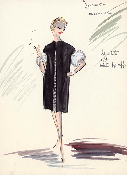
Figure 1. Edith Head, Too Late Blues, 1962. Archives, Wisconsin Historical Society.
Although using white helps in creating contrast, pure white often produces undesirable tones in the image. Jonas Howard writes: “white photographs glaringly and is unpleasant on the screen, offering, for one thing, too much contrast to other surrounding objects” (60). So why do we find so much white in Head’s costumes? Head explains: “White was what we called a ‘tek.’ It depended on the cameraman. Some of the cameramen wanted tek ones to some tek twos and I have had some cameramen who even wanted tek three or four, which is almost a deep ivory” (“The American Film Institute Seminars” 52). It is therefore necessary to note that the “whites” in Head’s are most often off-white colours, the degree to which was the determined by the designer in consultation with the cinematographer.
In addition to using these different “teks,” costume designers also used pink, yellow, and pale blue to produce white or a light shade of grey (Kehoe 24). The decision to use either yellow or white was to a certain extent dependent on the particular costume designer, cinematographer, director, or studio working on the film. Jonas Howard writes of orthochromatic stock: “Many directors and cameramen demand yellow collars, whereas in other studios it is the policy to have all bed and table linens pale pink to get the most satisfactory results” (60). Pink appears to have been a preferred colour for Head, as 21% of her dresses are pink and only 2% are yellow.
Head frequently uses brown in her designs, representing 12% of her dresses and 42% of her coats. This is in part due to panchromatic stock’s sensitivity to different shades of brown, which was especially important for make-up in panchromatic films. Vincent J-R Kehoe writes that brown make-up “gives various tones according to its colour, that is, from a light to a dark in approximately the same colour ratio as it appears in life” (24). Max Factor created a “Panchro” make-up that included nine shades of grease-paints and powders, nine shades of brown liner, and three shades of brown rouge that make-up artists could use to control the grey shading on the face (Baird 100). Panchromatic stock’s ability to approximate shade changes in the brown spectrum made it a useful colour for both make-up and costume design.
Brown frequently appears in Head’s designs for additional reasons. Edith Head occasionally used fur in dresses, as it not only indicated social status, but also provided costumes with visible texture (“The American Film Institute Seminars” 35). Warner Brother’s 1938 production of Jezebel illustrates another reason for this emphasis on brown in costumes. Designer Orry-Kelly was tasked with creating a dress for Bette Davis, whose character chooses to arrive at a stylish cotillion ball in a bright red dress instead of the requested white gown. One problem with panchromatic stock is that red can sometimes photograph as a dark grey or even black. Edith Head notes that costume designers “know that certain shades of red, for example, go to a particularly dirty grey in black and white” (“Dialogue on Film: Edith Head” 38). After experimenting with different colours, Kelly discovered that the perfect colour was a rust-brown (LaVine 80-81). Costume designers do not always use browns to connote “red,” but brown fabrics can be more vibrant than the muddy greys of red fabric. For the above reasons, there is little red in Edith Head’s costumes. Only 1% of her dresses are primarily red and, when Head does use red, she often combines them with whites and blacks in order to ensure a contrast with the murky greys produced by the red.
grey is another notable colour in Edith Head’s designs, as it is the primary colour in 7% of her dresses and 8% of her coats. Much like brown, black-and-white stock more faithfully reproduces different shades of grey in the world. Using grey is a way in which costume designers can have intimate control over how the fabrics will appear on film. For instance, Figure 2 is a design from the 1959 film Black Orchid. In this watercolour sketch, Head designs a grey denim work apron to go over a black dress.
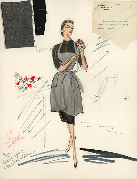
Figure 2. Edith Head, Black Orchid, 1959. Archives, Wisconsin Historical Society.
Blue and green round out the rest of the principal colours Head uses in her costumes. Panchromatic stock is least sensitive to bluish-green. Vincent J-R Kehoe writes: “royal or air blue gives a medium grey tone” and pale green photographs “slightly deeper in tone” (24). As a result, when Head does use blue or green, it is commonly lighter tones. Figure 3 is an example of a light green dress Edith Head designed for Grace Kelly for the 1954 film The Country Girl.
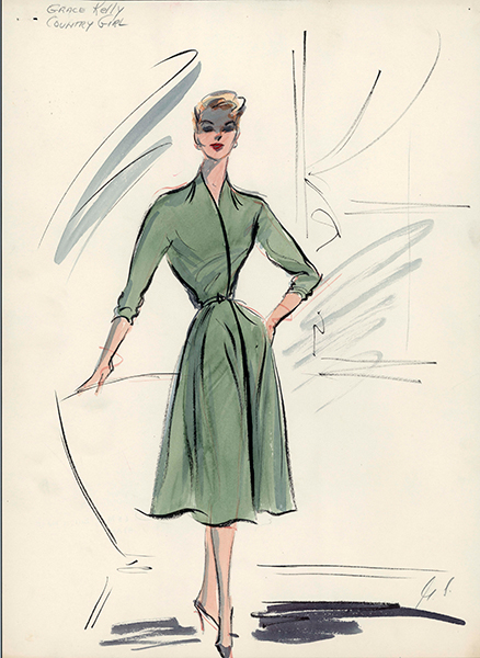
Figure 3. Edith Head, The Country Girl, 1954. Archives, Wisconsin Historical Society.
It is important to note that Edith Head’s designs occasionally consist of more than one colour. The large majority of Head’s costumes are one solid colour, however, and only 17% of her dresses and coats consist of some colour combination. It is possible that intricate designs and patterns run the risk of blurring together in an indistinct shade of grey. When Head does use different colours, it is frequently with blacks and whites to ensure a clear differentiation in the fabric. We can see that the colour combinations in figures 1 and 2 both involve black and/or white.
Head’s use of jewellery, fur, and embroidery also contributes to the contrast, texture, and depth of the costumes. In figure 1, for example, the white fur cuffs and bracelets contrast well with the black dress, and the cuffs contribute to the rich texture to the dress. Of course, the designer’s use of elements like fur and jewellery will often need narrative motivation. For instance, a character needs to be financially capable of obtaining a pearl necklace or diamond earrings. Otherwise there would be a noticeable break in narrative consistency.
To briefly summarize my argument, Hollywood costume designers were confronted with a set of problems when designing for black-and-white films. The sensitivities of panchromatic black-and-white film stock made it necessary for designers to use particular colours, patterns, materials, and accessories to foreground contrast and detail in their costumes. Costume designers did not merely leave these decisions to other craftspeople, but rather had intimate knowledge of what was needed to design for black-and-white film. Edith Head’s costumes help illustrate strategies designers used to address the challenges of black-and-white filmmaking.
The colours, designs, and accessories in Edith Head’s costumes could have alternate explanations. Perhaps the costumes in her sketches already existed in the studio from previous films and Head was encouraged to use them for financial reasons. If these costumes existed before the change from orthochromatic to panchromatic stock, the above analysis would be in need of revision, as most of the discussion about the characteristics of black-and-white stock is specifically about panchromatic stock.
It is true that Hollywood films sometimes reused costumes from earlier pictures, and there are notes on some Head sketches indicating the costumes are present in the studio archives. The large majority of these sketches, however, are marked and signed for purchase. Edith Head was, for most of her career, a prestige costume designer and reusing costumes was more common with lower-budget films.
In addition, if Head’s costumes were largely designed for other films, the colour films produced in the same time period as the black-and-white films should also share the same colour trends. This is not the case, however, as there are drastically different patterns of colour use for Head’s colour films as compared to her black-and-white films (see Figure 4). The only consistency in colour across Head’s black-and-white and colour films is the presence of black. While Head’s black dresses for her black-and-white films constitutes 20% of all of the colours, it represents 21% percent for her colour films. White, pink, and brown, on the other hand, fall from being the most prominent colours in Head’s black-and-white designs to among the least used. Head’s use of white drops 21% percent, pink 18%, and brown 9%. grey also shifts from constituting 7% of the dresses in the black-and-white films to less than 1% in the colour films.
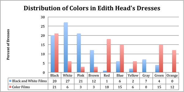
Figure 4. Distribution of colours in Edith Head’s Dresses
The reason for this drop is partly due to the nature of these colours. Many of Head’s colour films were shot Technicolour, which is a film process that produces bold, saturated colours. Designers wanted to take advantage of the bright, vibrant Technicolour process. When Head does use colours that are not traditionally vivid, like black, white, brown, and grey, they are often elaborated by jewellery and intricate designs to exploit the sensitivities of Technicolour. For instance, Figure 5 is a watercolour sketch from the 1955 Technicolour film Artists and Models. The plain grey smock and black pants are not only brightened by the yellow hat and scarf, but also by the pink, green, and yellow patches the coat.
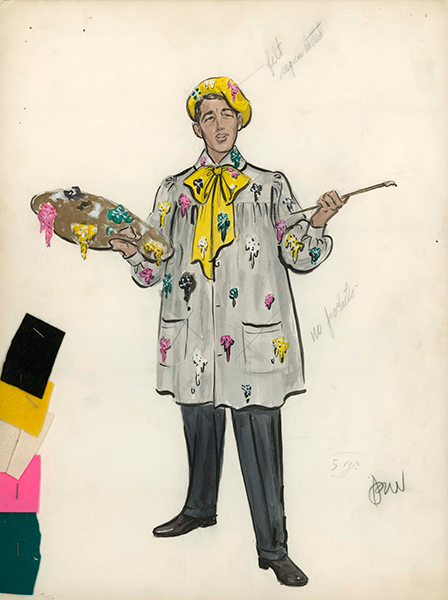
Figure 5. Edith Head, Artists and Models, 1955. Archives, Wisconsin Historical Society.
Edith Head integrates bolder, brighter colours in her colour film costumes. Head’s use of red jumps 17% in her colour films, green and orange increase 11%, blue 9%, and yellow 4%. Again, Head’s work on Technicolour films is a central reason for the increase of these particular colours. Head would not have designed the dress in Figure 6 from the 1961 Technicolour film Breakfast at Tiffany’s for black-and-white stock. Head uses the yellow to add detail and brighten up the design, whereas the white and light yellow would have been indistinguishable on black-and-white stock.
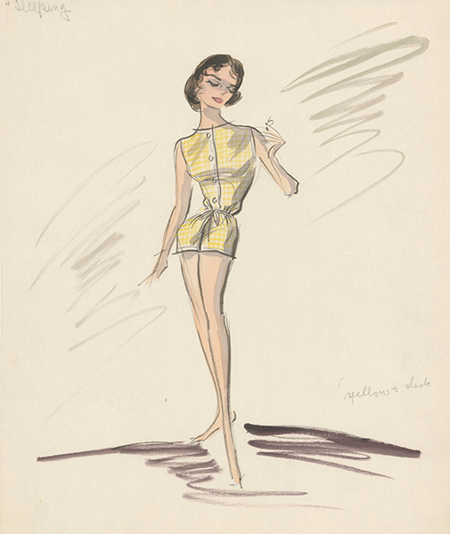
Figure 6. Edith Head, Breakfast at Tiffany’s, 1961. Archives, Wisconsin Historical Society.
colour films allowed for more design options than merely the available colours that could be used. When asked if colour film stock provides more visual possibilities for her costumes, Head replies: “Oh yes … you can do more shading. Much more subtle designing” (“The American Film Institute Seminars” 36). This emphasis on subtle design is evident in Head’s watercolour sketches. While 23% of the dress and coat sketches for Head’s black-and-white films contain colour combinations (that is, more than one colour on a particular piece of clothing), 64% percent of her dress and coat sketches contain similar combinations for her colour films. In sketches like figure 5, Head uses intricate colour patterns and designs that may not have been recognized by panchromatic black-and-white stock.
In addition to the Head’s use of colours and detail, additional evidence supports my claim that Head specifically designed her clothing for particular film stocks. Head often staples samples on her sketches to indicate the colour, texture, and design of the fabric to be purchased. In every sketch in which such a sample was included, the colour and design of the sample closely corresponds to the colour and design of Head’s sketch (see figures 2 and 4). In addition, in many of her interviews, Head demonstrates an intimate understanding of how colours interact with black-and-white stock and explicitly states that she designed differently depending on the nature of the stock.
Edith Head’s knowledge and input about costume colour in black-and-white films was not anomalous. David Bodwell, Janet Steiger, and Kristen Thompson note:
After the narrative production increase in 1907, the individual firms began purchasing and making their own wardrobes as well as renting them, and out of this need came another theatrical carry-over, the position of the wardrobe mistress, common by the early teens. Besides preparing the costumes, she was responsible for considering the photographic effects of the textures and colours of her materials. (149)
We should not generalize these findings about the ways in which Edith Head designed for black-and-white film to every designer working in Hollywood. It is clear, however, that Head and other designers knew how their costumes would interact with different film stocks and made costuming decisions based on that knowledge.
The claim that costume designers knew about the sensitivities of film stock and this was an important influence on how they designed their costumes may seem like a modest claim. One may ask: What is the significance of this in the larger study of costume design? Does it have any impact on the way we should study costumes in cinema? Is it merely a narrow historical detail about the division of labor Hollywood studios?
Let us consider a pair of arguments about the function of costume design and see how such craft concerns may factor into these kinds of analyses. Sarah Street contends that, in A Night to Remember (1958), Charles Lightoller is identified with his
thick, large-collared woolen jumper. As an item of clothing it stands for his dependability and his stoicism, an article which provides comfort in the freezing conditions but also serves as an appropriate symbol of his importance as the man who gives orders and supervises much of the lifeboat operation with professionalism and sensitivity. (17)
Jane Gaines makes a related argument in her article “Costume and Narrative,” but connects the choices in costume material to the deeper thematic concerns that lie at the heart of the woman’s picture. In particular, Gaines argues that costuming in the woman’s picture will sometimes utilize garments such as fur, velvet, and wool that are “connotatively rich enough to match the volume of suffering” and that function “somewhat like the surrogate sufferer device” (208-209).
Both analyses provide an explanation of the costume design in these particular films. Although it is plausible that the costumes do have these particular thematic functions, I would argue that the need for contrast and detail in black-and-white films is a more pressing factor in design process. That is, if the wool jumper in A Night to Remember or the fur coat in the woman’s film are indistinguishable from the other parts of the costume or the set design, or even unidentifiably wool or fur, this would stifle any of the connotative meanings proposed above.
The concern for contrast and detail does not invalidate this kind of interpretive work on the function of costume in cinema. It can instead enrich and nuance this scholarship and provide another tool with which to construct arguments and conclusions. For instance, in an analysis of the woman’s picture, perhaps there are a variety of different furs available to the costume designer that all provide adequate contrast and detail in a particular scene, and we notice a patterned use of a particular kind of fur at moments in the narrative when the suffering in the narrative is at its greatest. We can then provide an explanation of the costume choices that takes into account both the technical and narrative demands of the film, allowing for careful, illuminating explanations of film practice and function.
In addition, costume design was one of few prominent positions in the Hollywood studio system where women could work and even gain power and fame. It is important to recognize that costume designers had some agency in knowing about and designing according to film stock sensitivities. They did not merely leave these creative decisions to the predominantly male cinematographers working on the film.
This examination of the ways in which Edith Head responded to the sensitivities of black-and-white film stock is a preliminary step in understanding how costume designers worked in the industry. There are still many unanswered questions about costume design in Hollywood. For example, how did costume designers coordinate their work with set designers? Are there certain colours that were consistently matched with particular actors and actresses? Are there colours that were used more frequently for blondes, brunettes, redheads, etc.? In addition, we can compare Edith Head’s designs with a wide sample other costume designers, set designers, and cinematographers to better understand the ways in which artists in the industry used colour for black-and-white films.
While costume designers knew about the general sensitivities of panchromatic film stock, it still is not exactly clear to what extent they knew about differences in panchromatic stock. For instance, sensitizing dyes added to the film stock would sometimes change the relative colour sensitivity of the stock. In addition, coloured filters placed on the camera lens and the lights would alter the ways that filmed objects would interact with the stock. Occasionally, both orthochromatic and panchromatic film stock would be used on the same film. So while it is clear that some costume designers were knowledgeable about the sensitivities of panchromatic film stock, it is an open question to what extent they knew about the ways that the film stock and lighting would be handled in the film for which they were designing.
All of these questions bring us back to the notion of Hollywood filmmaking as a collaborate art. Hollywood movies engage us in a variety of different ways. They tell stories, elicit emotions, and communicate themes about humanity and society. The construction of these films is highly complex process that depends on many highly trained artists working collectively toward a common goal.
Endnotes
[1] I use the following black-and-white and colour films for my analysis: black-and-white films – The Country Girl (1954), The Black Orchid (1958), But Not for Me(1959), Career (1959), Don’t Give Up Ship (1959), Too Late Blues (1961), Love with a Proper Stranger (1963), 36 Hours (1965), and Sylvia (1965); colour films – Artists and Models (1955), Breakfast at Tiffany’s (1961), Girls! Girls! Girls! (1962), and Donovan’s Reef (1963).
Bibliography
Alicia Annas, “The Photographic Formula: Hairstyles and Makeup in Historical Films.” Hollywood and History: Costume Design in Film. Ed. Edward Maeder et al. Los Angeles: Thames and Hudson, 1990: 52-78.
Artists and Models. DVD. Directed by Frank Tashlin. 1955. Hollywood, CA: Paramount Home Entertainment, 2007.
John F. Baird, Make-up: A Manual for the Use of Actors, Amateurs and Professional. New York: Samuel French, 1930.
James Barker, “Make-up For Fast Film.” American Cinematographer. 12.7 (1931): 11, 24.
Black Orchid. DVD. Directed by Charles Saunders. 1953. Off-air recording of ABC-TV broadcast, 2007.
David Bordwell, Janet Staiger and Kristin Thompson, The Classical Hollywood Cinema: Film Style and Mode of Production to 1980. New York: Columbia University Press, 1985.
Stella Bruzzi,Undressing Cinema: Clothing and Identity in the Movies. New York:Routledge, 1997.
David Chierichetti, Hollywood Costume Design. New York: Harmony Books, 1976.
Holly Cole and Kristin Burke, Costuming for Film: The Art and the Craft. Los Angeles: Silman-James Press, 2005.
Pam Cook, Fashioning the Nation: Costume and Identity in British Cinema. London: British Film Institute, 1996.
The Country Girl. DVD. Directed by George Seaton. 1954. Hollywood, CA: Paramount Home Entertainment, 2004.
Jane Gaines, “Costume and Narrative: How Dress Tells the Woman’s Story.” In
Fabrications: Costumes and the Female Body. Ed. Jane Gaines and Charlotte Herzog. New York: Routledge, 1990: 180-211.
Edith Head, “The American Film Institute Seminars,” Edith Head: An American Film Institute Seminar on Her Work (Glen Rock, NJ: American Film Institute, 1977): 1-85.
—.“Clothes-Wise: Edith Head.” Interview by Virginia Wright Wexman and Patricia Erens. Take One 5, no. 4 (1976): 12-13.
—. “Dialogue on Film: Edith Head.” American Film 3, no.7 (1978): 33-48.
—. Papers, 1934-1965. Wisconsin Historical Society Archives, Madison, Wisconsin.
Howard, Jonas. “There Are No ‘Motion’ Pictures.” Photoplay 16, no.5 (October 1919): 59-60, 115.
Jezebel. DVD. Directed by William Wyler. 1938. Hollywood, CA: Warner Home Video, 2006.
Vincent J-R.Kehoe, The Technique of Film and Television Make-Up. New York: Hastings House, Publishers, 1969.
Pat Kirkham, “Dance, Dreams and Desire: Fashion and Fantasy in ‘Dance Hall’.” Journal of Design History 8, no. 3 (1995): 195-214.
LaVine, Robert W. In a Glamorous Fashion: The Fabulous Years of Hollywood Costume Design. New York: Charles Scribner’s Sons, 1980.
Edward Maeder,“The Celluloid Image: Historical Dress in Film.” Hollywood and History: Costume Design in Film. Ed. Edward Maeder et al. Los Angeles: Thames and Hudson, 1990: 9-42.
Kris Malkiewicz,Cinematography. New York: Simon and Schuster, 1989.
A Night to Remember. DVD. 1958. Directed by Roy Ward Baker. Hollywood, CA: Criterion Collection, 2012.
Sarah Street,Costume and Cinema: Dress Codes in Popular Film. New York: Wallflower Press, 2001.
Too Late Blues. DVD. 1961. Directed by John Cassavetes. Hollywood, CA: Olive Films, 2012.
